Who’s feeling chilly? ME!
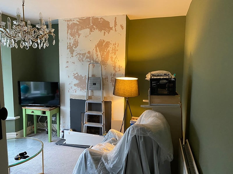
This January was exceptionally cold, in fact it was the coldest January in ten years, I really felt it! This February is much the same and more snow is on its way. It’s been so cold I have even discovered usb chargeable hand warmers which have been life changing, especially on early morning dog walks. But it’s not hand warmers of the pocket variety I’m wanting to shout about, it’s something much more exciting than that. Here is a ‘before’ shot to keep you guessing!
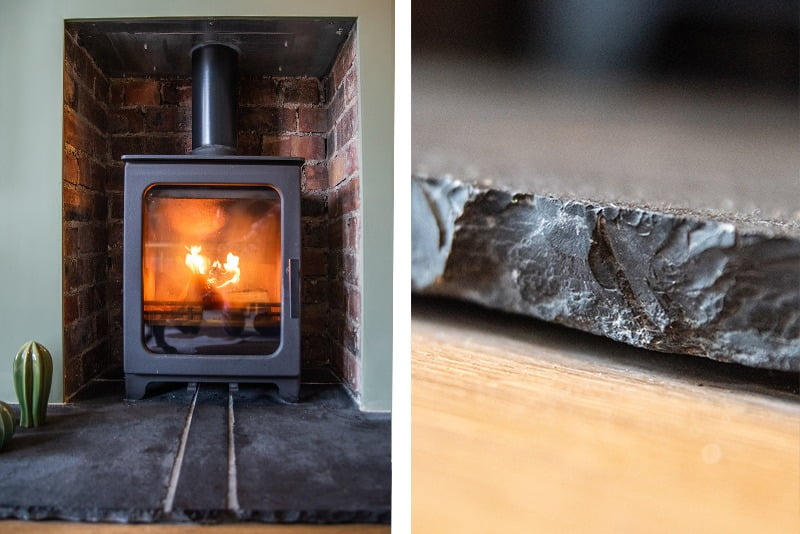
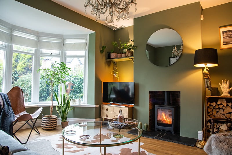
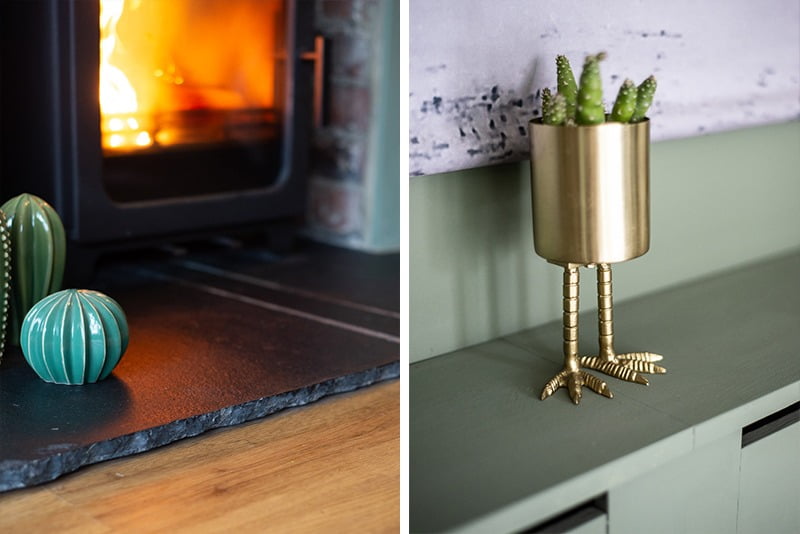
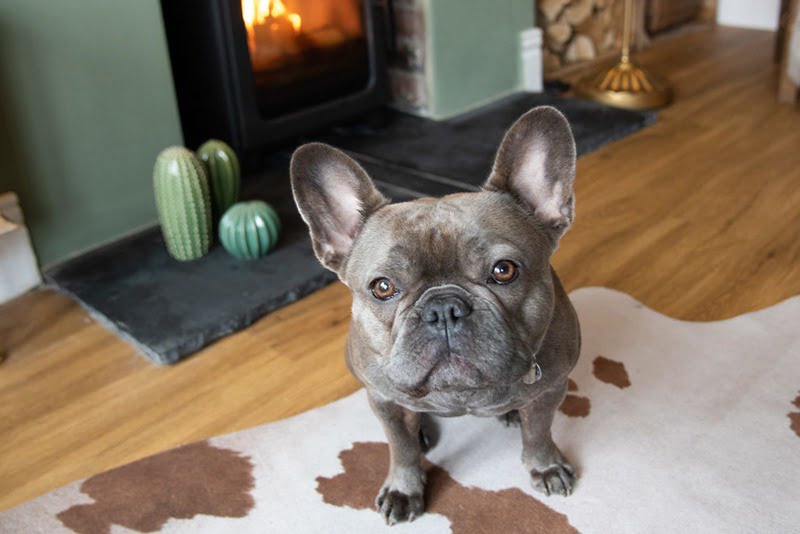
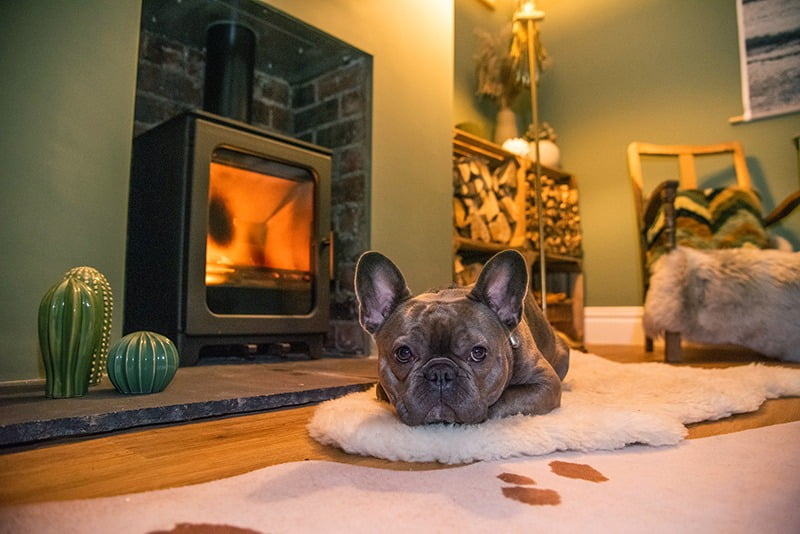
This winter we welcomed into our home a new friend, a working-from-home treat and an absolute saviour in fact! All this in the form of an amazing Woodpecker Log Burning Multi-Fuel Stove installed in our living room last month. This warmed our hands, toes and our heat greedy pooch dog who is currently living her best life! Her face looks sad, but she’s happy as Larry! (btw.. does anyone know who Larry is?)
The wonderful Newcastle based
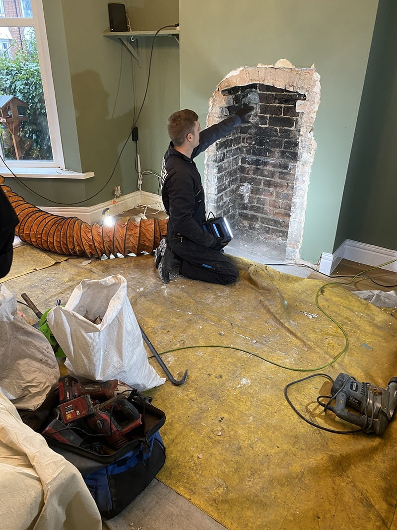
Northern Stove did a fantastic job of installation, they were friendly, extremely tidy and respectful with noise, important when working from home. Jonny came initially to measure up, gave great advice on approach and finishes followed up later by Jonny’s Business Partner Scott and Andy coming to install the Log Burner.
They kindly checked in with us for decisions on intricate design details like the size of the opening in relation to the stove size, brickwork and hearth width. They even added a bird guard on our chimney top as having never been on our roof, we didn’t realise it was missing.
The chimney breast was to be knocked out to expose the brick work, which has a 90 year history having being laid in 1930! A slab of rough cut limestone was to be our hearth so I braced myself for the dust but there was none! This was due to fab gizmo which sucked it all out and shot it out the window. Bingo! Here is Northern Stove’s Scott discussing the preferred height of the opening during installation for you to see their slick operation.
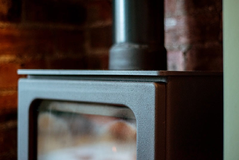
The brickwork was intact and worthy of a clean up and just look at the great job Northern Stove’s Scott and Andy did! The whole job of knocking out, cleaning up, stove installation to current regs including chimney lining and alarms fitted took less than two days. We were so happy with the work I thought it worth shouting about the team on here.
Once the painstaking job of sitting watching plaster dry for a week was over, (visually unfinished things like this drive me potty) the final touches of paintwork could be completed in this newly refurbished room.
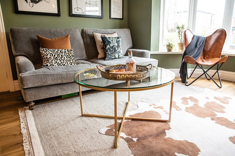
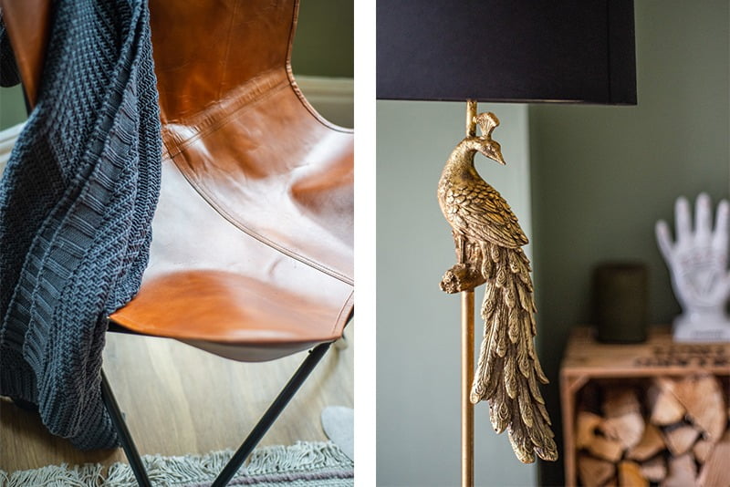
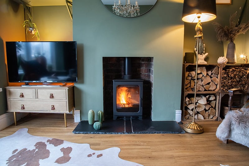
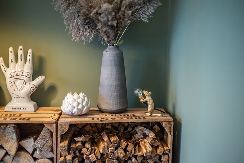
The theme was traditional materials reflected by the main focus, our cast iron and steel Wood Burning Stove together with colours green and gold. For soft furnishings I wanted natural materials such as leather, cotton, sheepskin and wool adding comfort and texture. Having grown up on dairy farms I have a great sentiment for cattle so my cow skin is absolute fakery from Wayfair!
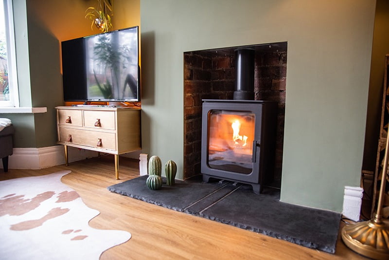
I’ve included a few before and after pictures as we replaced the carpet with a wood floor oak finish and painted the walls with Little Green’s calming Sage Green on recommendation from a friend (thanks Paula) who is also bonkers for interior design.
I’d really gone to town with the design details selecting woven fabrics, mat ceramics and check out my gold pot with bird feet below (thanks Lisa) with the intension of capturing Interior Design Photography incorporating the burner too. This felt particularly relevant as currently I’m splitting my time between studio and home during this pesky pandemic.
I bargain hunted, scouring the internet finding vases, sheepskins, baskets and
cushions from Dunelm, (check them out and you too will find the nuggets)
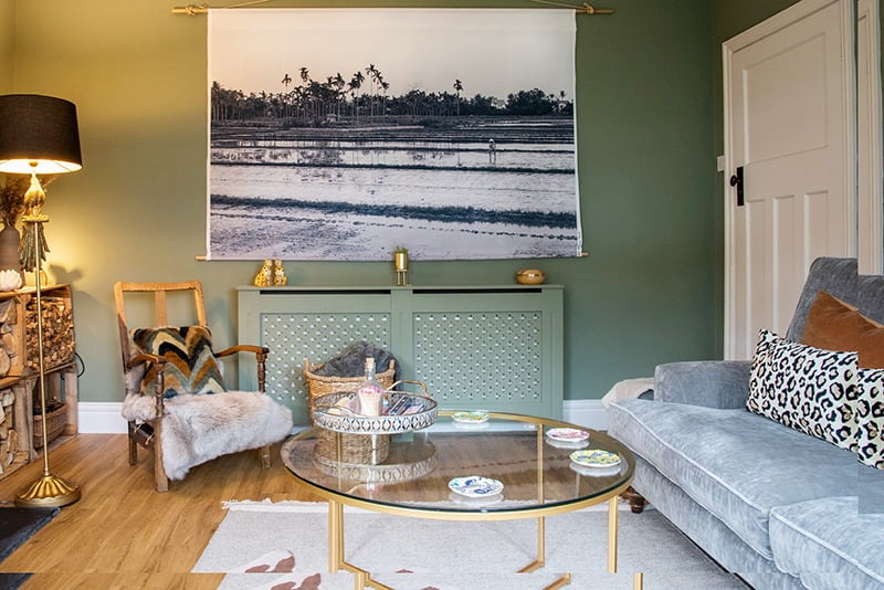
floor lamp from Next Home (this was the big spend), leather butterfly chair from Ebay, a second hand chair (an upholstery project draped in a sheepskin for now) from St Oswald’s Charity shop,
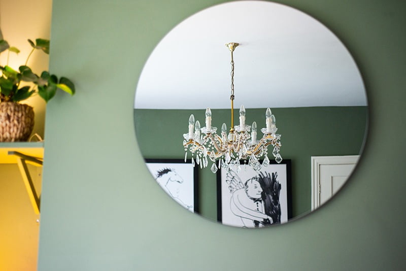
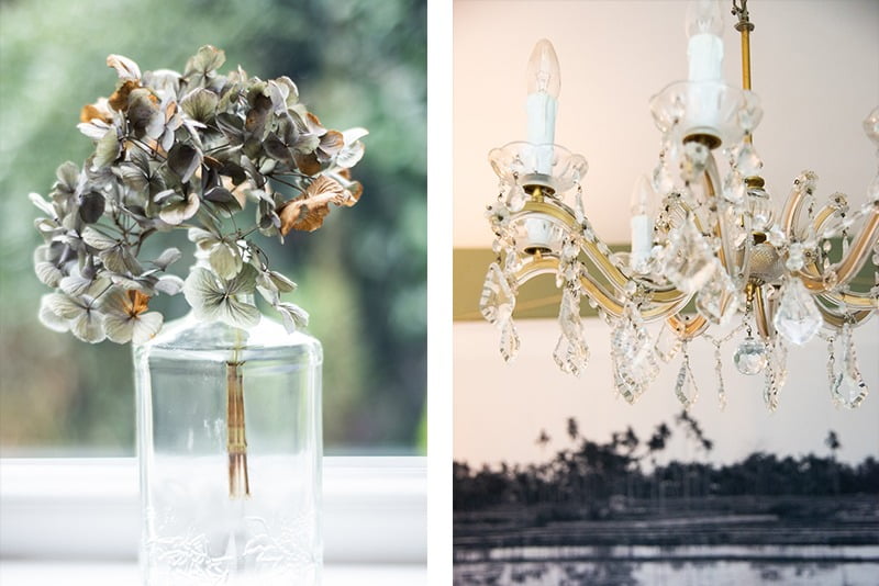
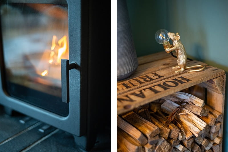
wool rug from Benuta and 4 old wooden fruit boxes from a skip in Newcastle (I have absolutely no shame) which all were ace pieces to capture. Our 1950-60’s chandelier I bartered and bought in an antique shop in Hexham.
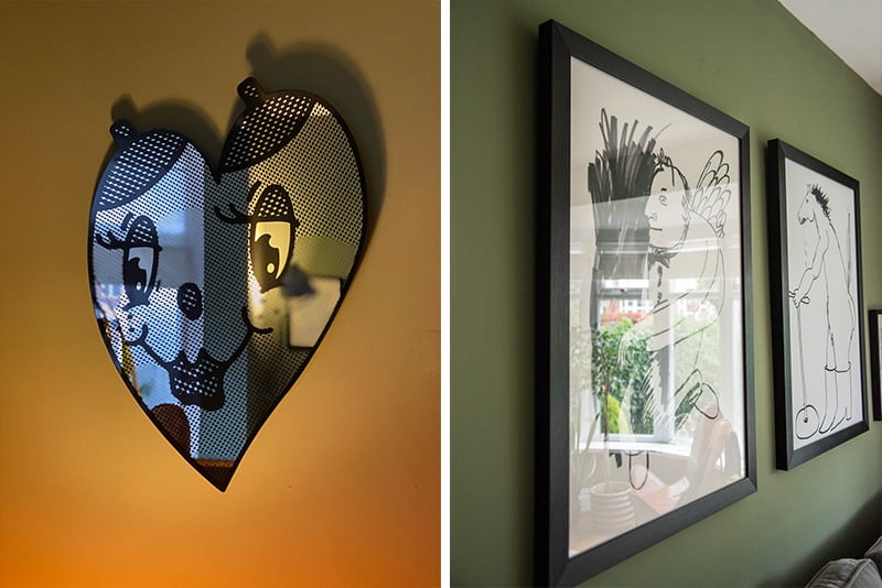
Along with many things old and recycled, I added a brand spanking new piece of art, a shiny new Heart Break Mirror that was designed by
Patrick Schmidt who is a friend and a London based illustrator so feel free to click on his name to whizz over to his website where you can see the work he creates along with his online shop. I am a big fan!
The black pen drawn illustrations in frames are non other than Jim Moir’s portraits of Bob Mortimer drawn for FHM many years back before it went into administration, they make me smile daily at their silliness!
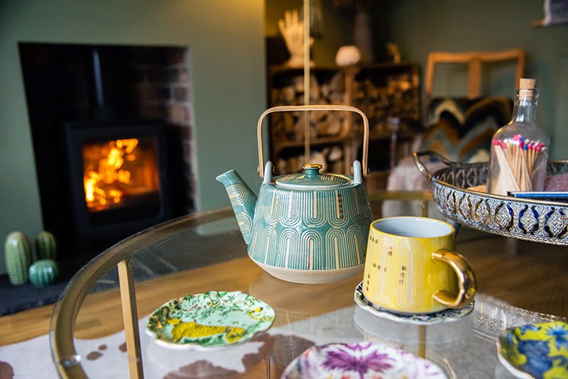
The theme for this room was natural materials, comfort and warmth so hopefully when you look at these images you’ll feel the glow from within! It’s now time for my tea break so fitting with the theme of traditional and natural materials such as glass, cast iron and timber, I’m adding porcelain to the list with this tea set from
Oliver Bonas. Tea, a big softie (my Frenchie pup) and a cosy wood burner what’s not to love with this incredible comforting combo?