No products in the cart.
One of the things clients often ask before their headshot session is “What should I wear?”
While fit and style are important, colour is something I always think about carefully during a shoot. The colours you wear and the backdrop we choose together can make a huge difference to how polished, professional, and cohesive your final images look.
A well-chosen colour combination helps the focus stay exactly where it should be — on you.
If clothing and background colours clash or compete for attention, the image can feel busy or distracting. When colours are coordinated thoughtfully, the result is a clean, balanced portrait that feels natural and professional.
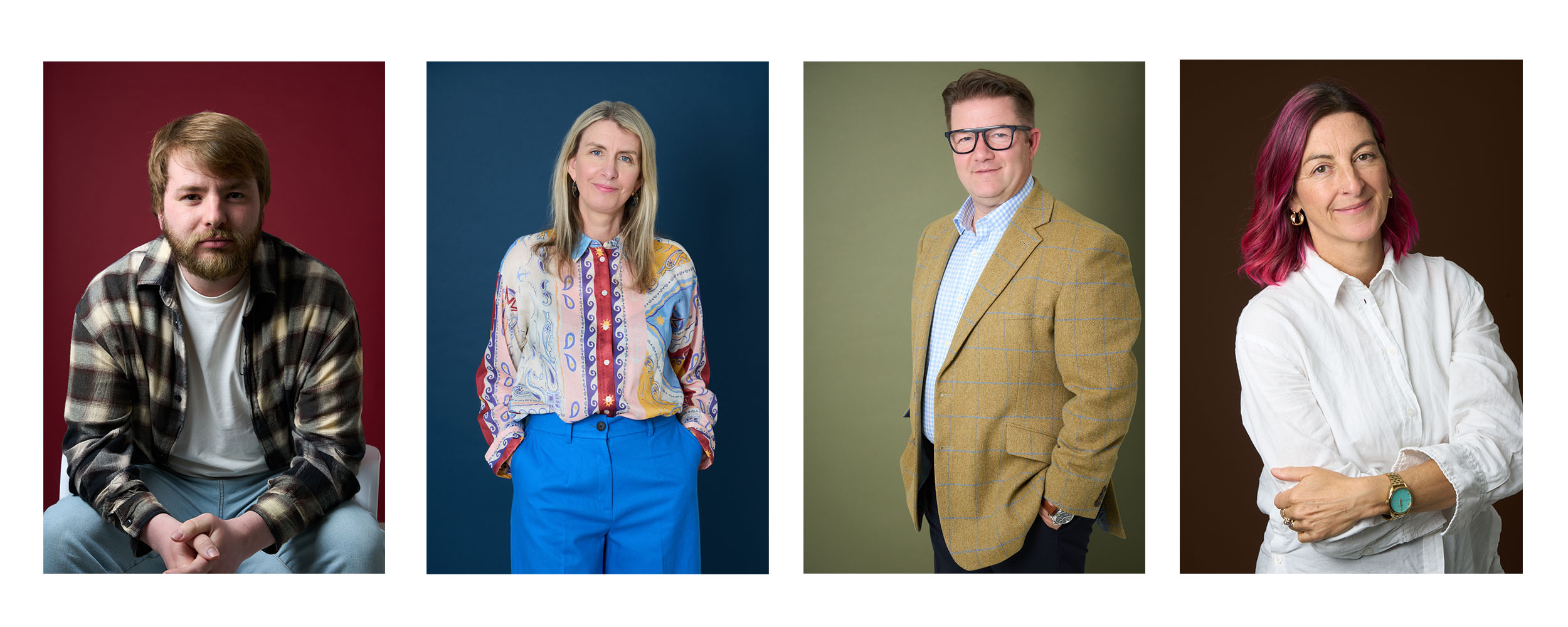
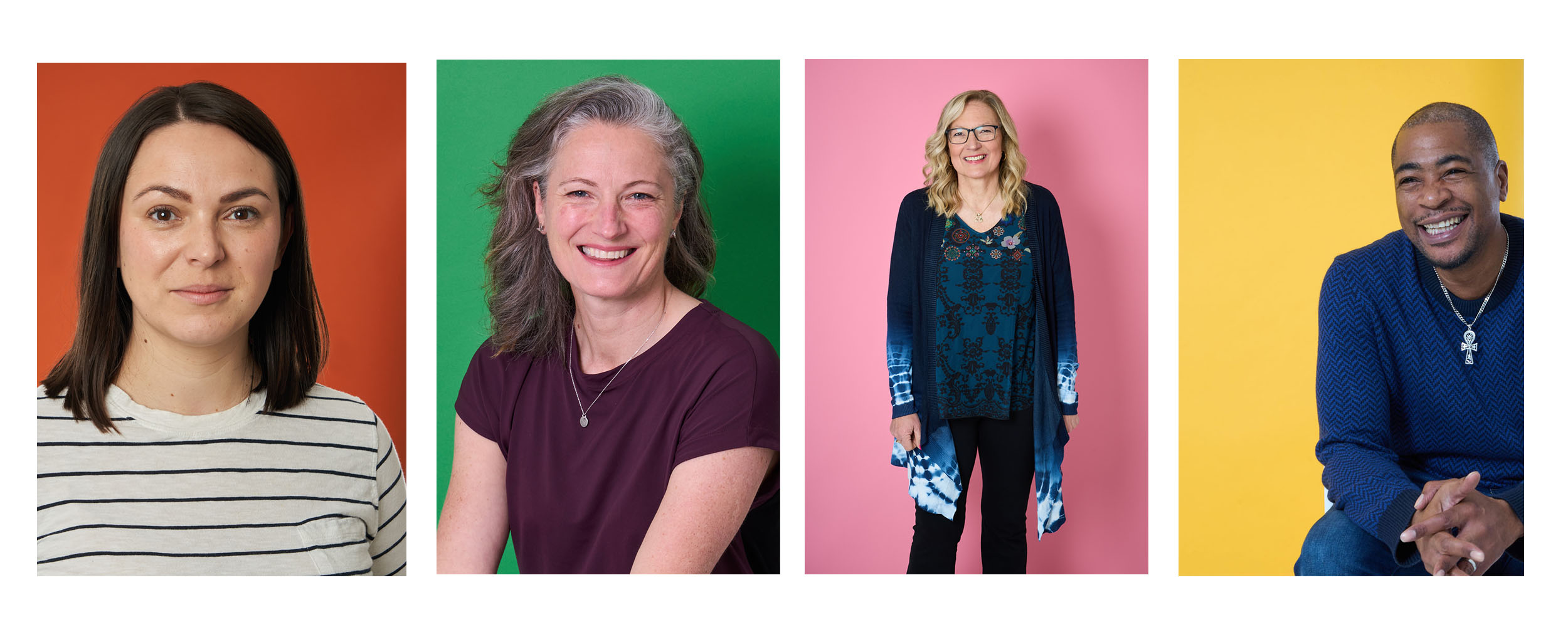
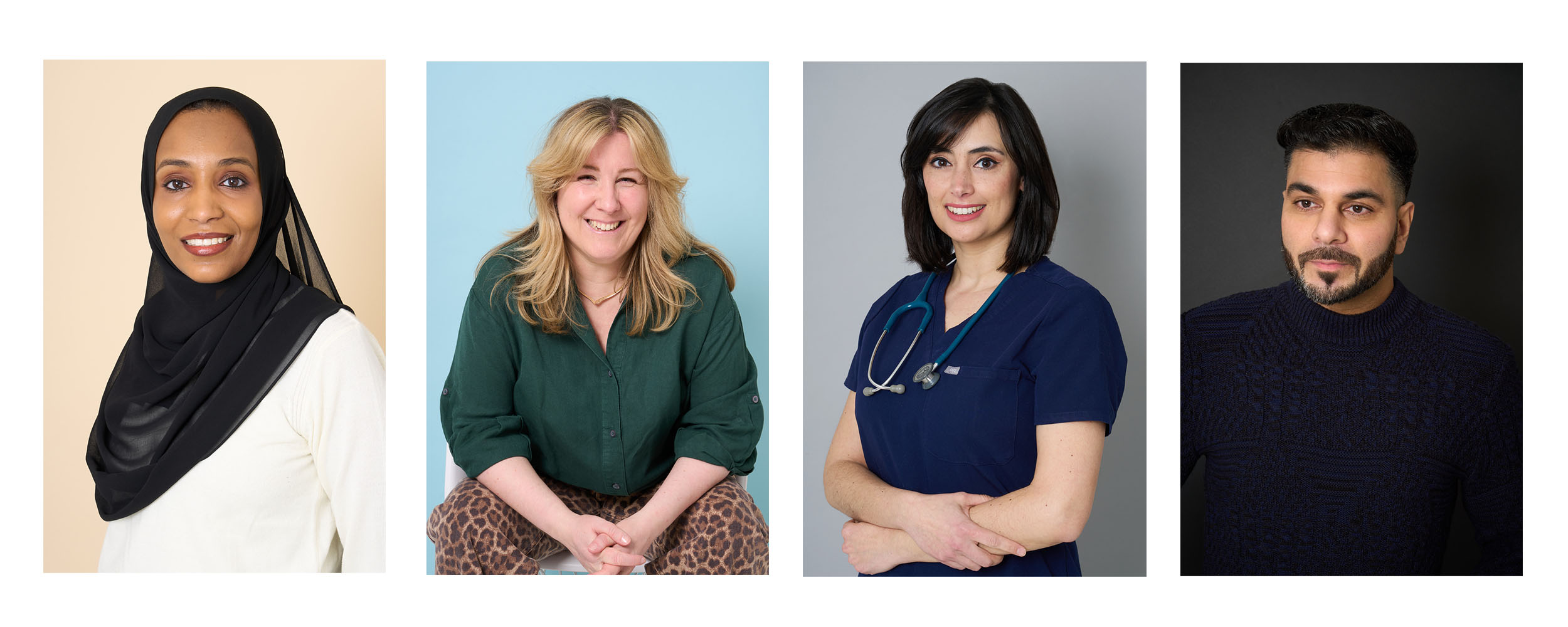
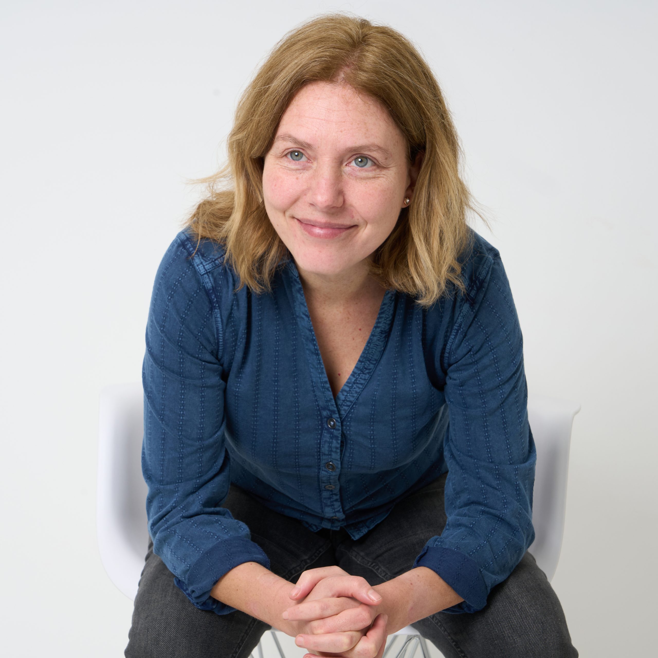
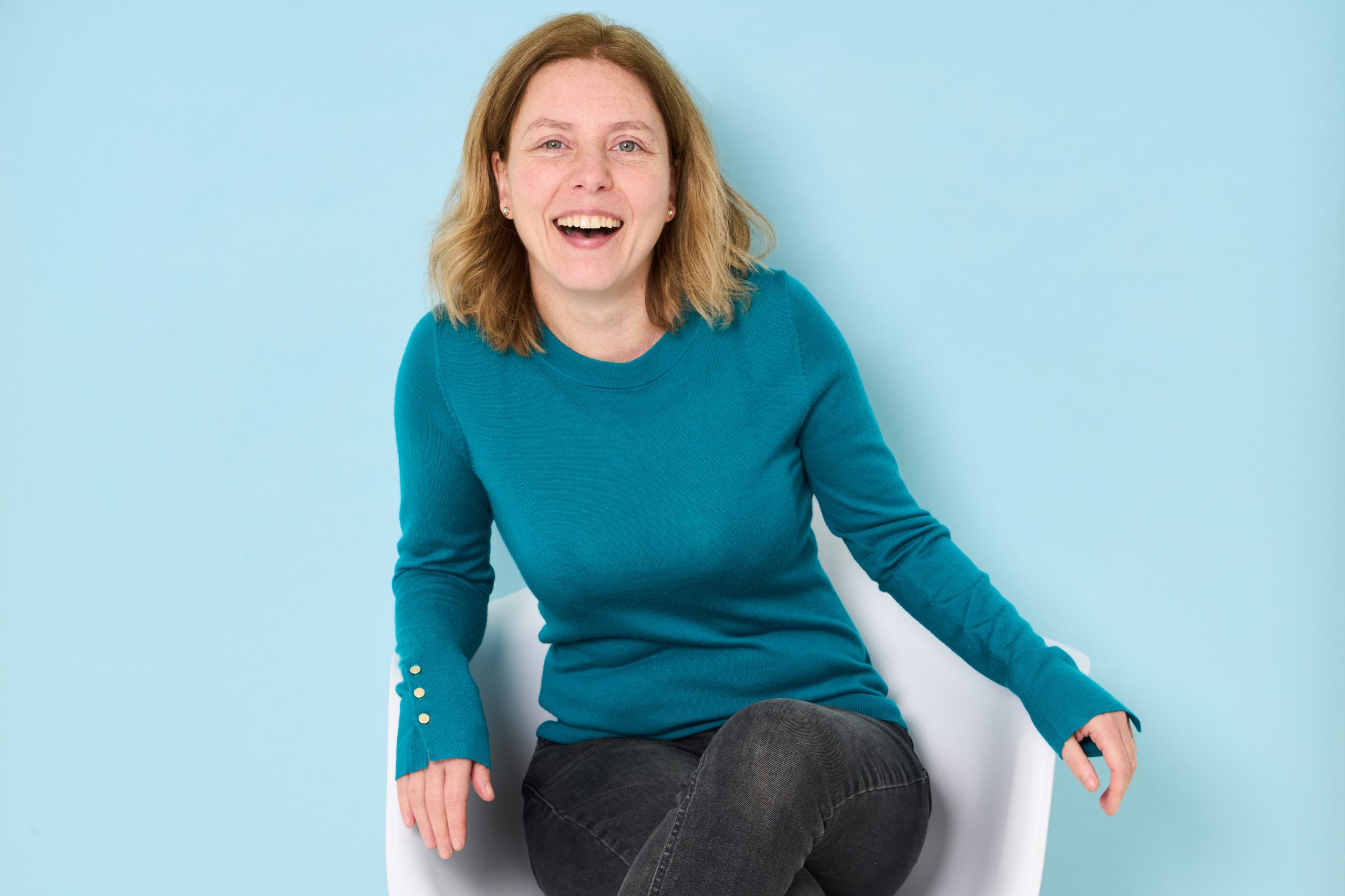
During every session, I look at what my client has brought to wear and then select a paper backdrop that either complements or blends beautifully with their outfit.
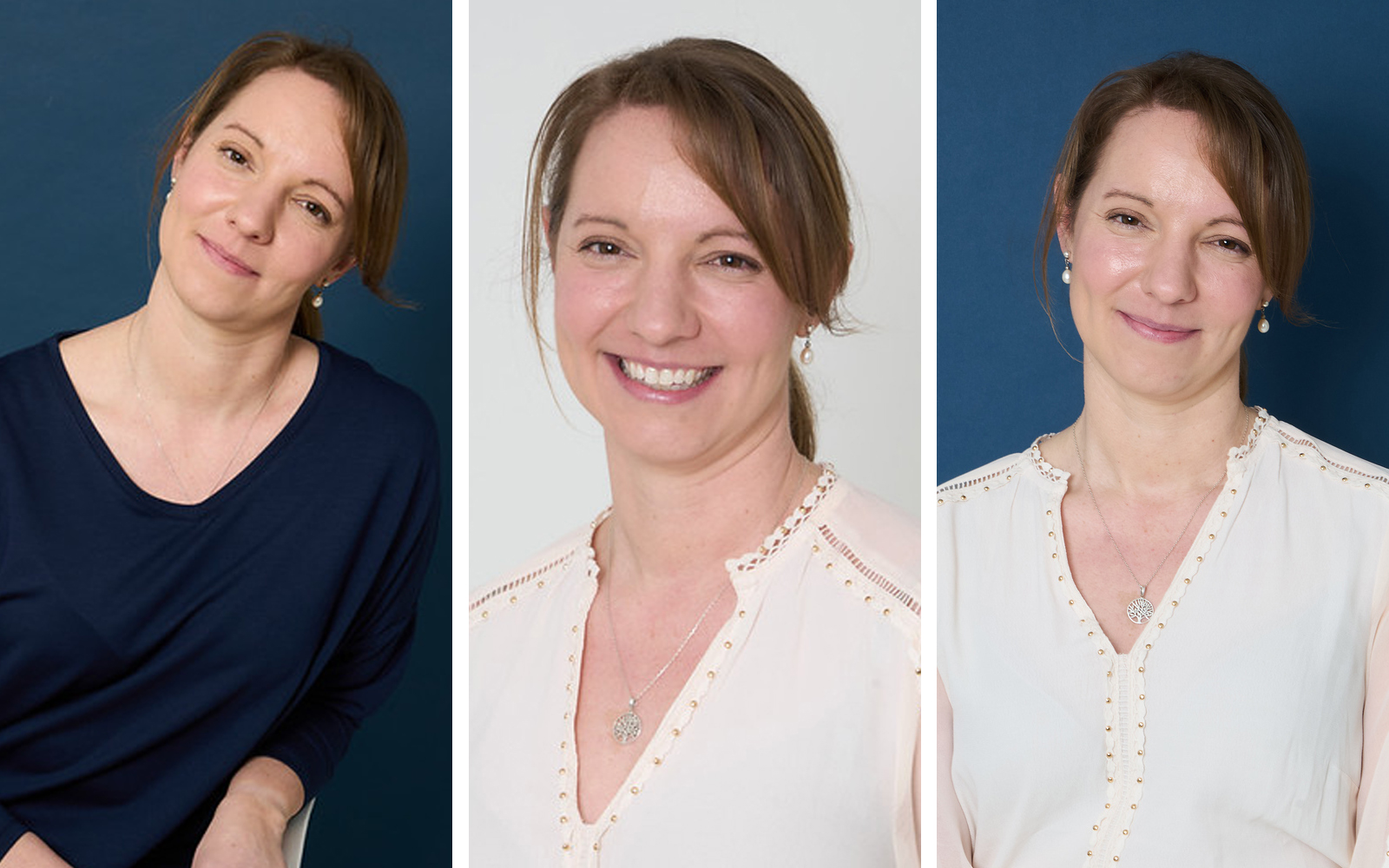
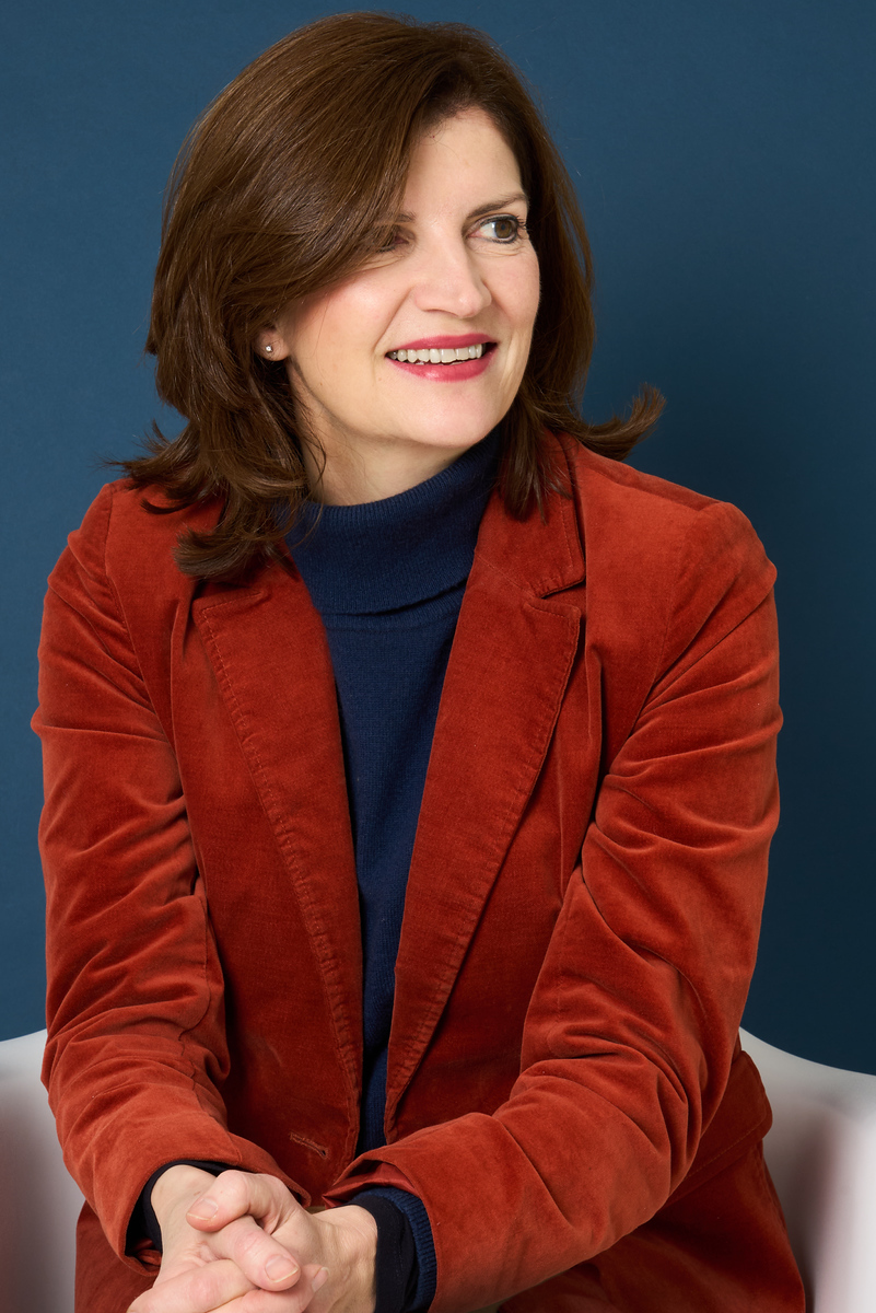
Emma recently came in for headshots for her private practice, consultancy work and conference speaking.
She brought two outfits that worked perfectly for professional portraits:
For the cream blouse, we paired it with a backdrop that kept the look soft and neutral. This creates a very approachable feel — ideal for healthcare professionals, therapists and consultants who want to appear warm and welcoming.
With the blue jumper, we chose a backdrop that complemented the colour while still allowing her to stand out. The result was a slightly more polished and professional look while still feeling natural.
Small adjustments like this make a big difference to the final images.
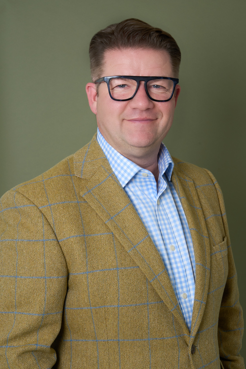
I keep a range of coloured paper backdrops in the studio so we can create different looks depending on your brand, industry, and personal style.

When choosing a backdrop, I usually think about one of three approaches:
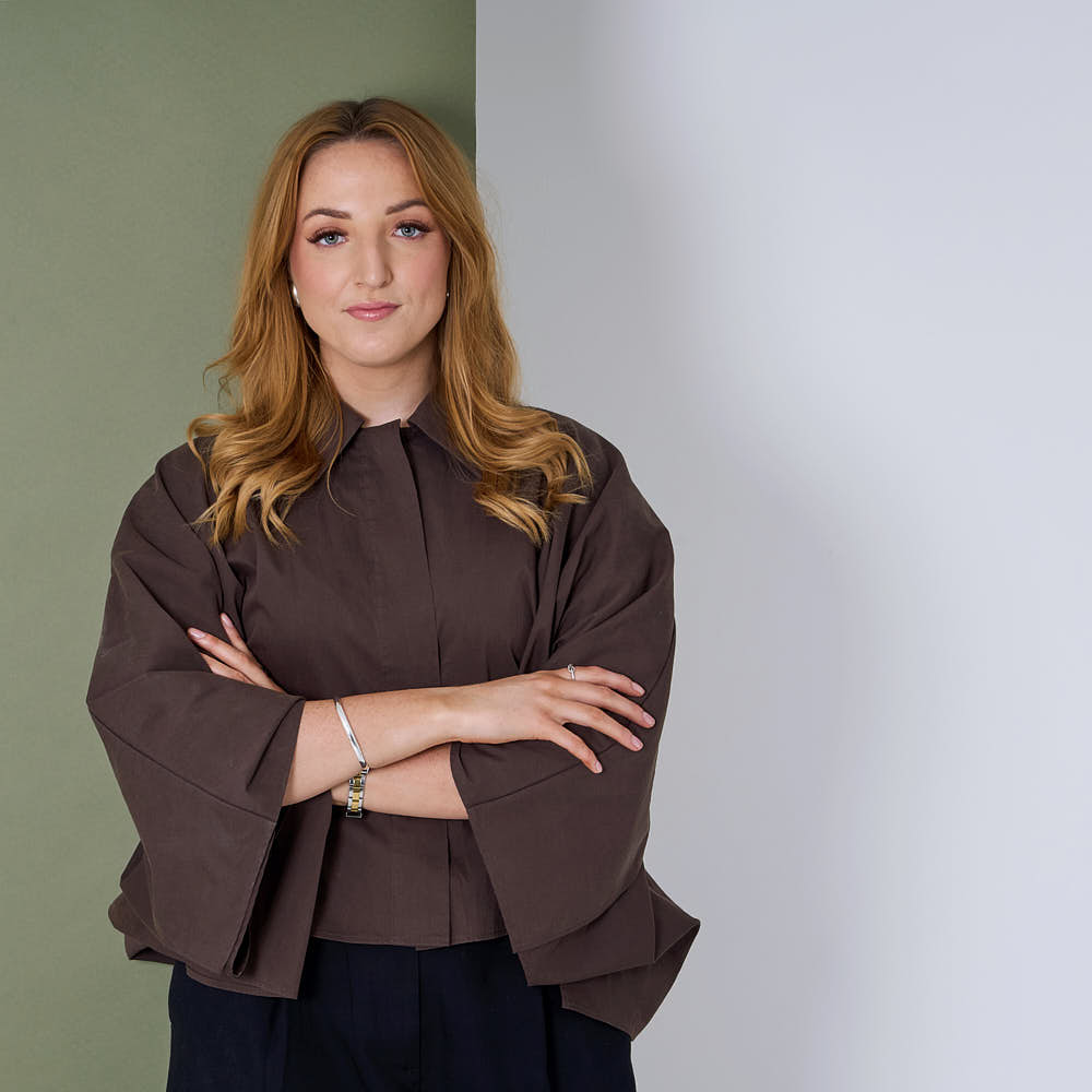
Every headshot session starts with a conversation about how the images will be used. While colour coordination is important, it’s just as important that the final photographs fit your brand, workplace, or personal style.
For some clients, that means matching their brand colours. If you have a logo, website or established branding, we can choose clothing and backdrop colours that work alongside those tones. This helps your images feel consistent across your website, LinkedIn profile, marketing materials and presentations.
For example, we might pair your outfit with a backdrop that echoes a colour used in your logo or complements the palette used on your website. These small details help everything feel visually connected and professional.
For other clients, the goal is the opposite. Sometimes the headshot needs to sit within a very colourful environment, such as a busy website design, magazine layout, or conference programme. In those cases, we may choose a more neutral backdrop and clothing combination so the image remains clean and versatile without competing with the surrounding design.
Listening carefully to each client’s brief helps guide these decisions. Whether the goal is to align with existing branding or create a simple, neutral portrait that can work anywhere, we’ll choose colours that support how and where your images will be used.
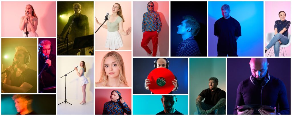
While most headshot sessions focus on clean, professional portraits, colour can also be used in more creative ways.
In addition to paper backdrops, I can use colour gels on studio lighting to introduce subtle washes of colour into the background. This creates a softer, more translucent effect and can add atmosphere or visual interest to the portrait.
These techniques work particularly well for portfolio shoots, where there is more time to experiment with lighting and styling. They are also popular for artist press shoots, performers, and people working in the creative industries who may want images that feel a little more distinctive and expressive.
By carefully controlling the lighting and colour, we can create portraits that still feel polished while adding an extra layer of personality.
I always recommend bringing two or three outfit options to your session. This allows us to experiment with different combinations and gives you variety in your final images.
Even small changes — like switching from a jacket to a knit, or from a light top to a darker one — can create a completely different feel.
The aim is always to create headshots that feel like you, just on your best day.
By pairing the right clothing colours with the right backdrop, we can create images that look polished, consistent and natural — perfect for websites, LinkedIn profiles, speaking engagements and publications.
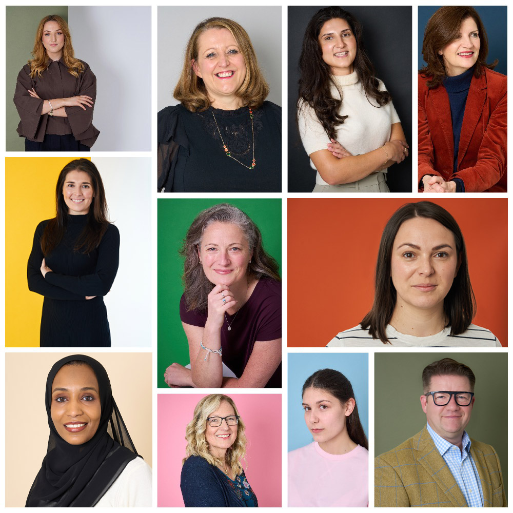
In the examples below, you’ll see a selection of real clients wearing different colours and how we matched those with backdrops during their sessions.